
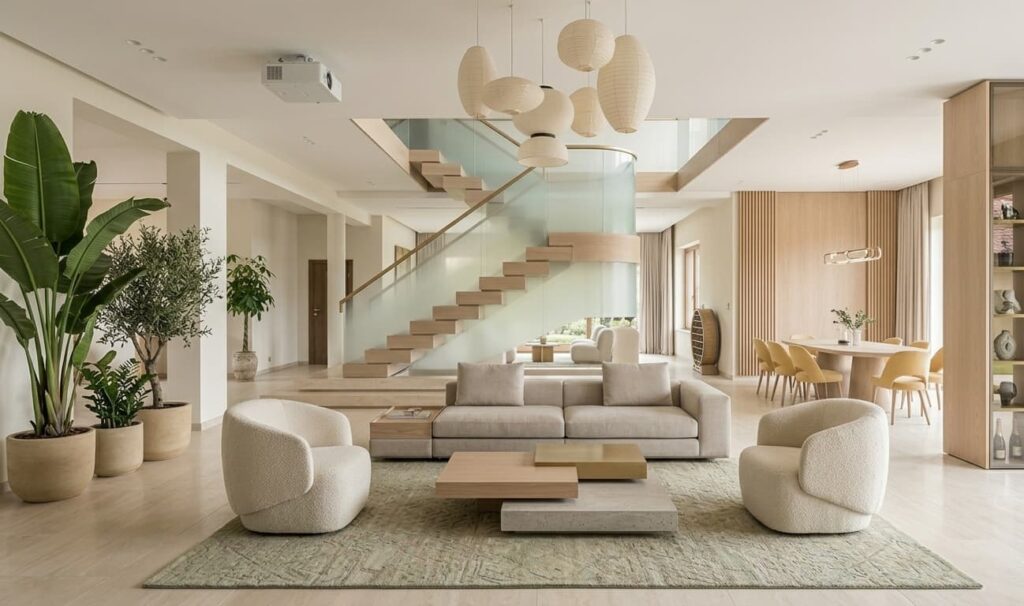
Quick Summary
Choosing the ideal color scheme for a villa requires balancing massive spatial scale, natural illumination, and architectural flow. This professional guide details premium palette selections, room-by-room strategic layouts, paint finish recommendations, and techniques to maintain visual harmony across expansive, multi-level residences.
Understanding Spatial Scale and Color in Large Estates
Villas present unique architectural challenges that standard residential properties do not face. The sheer scale of these structures, characterized by double-height ceilings, wide corridors, and sprawling open-plan layouts, directly impacts how paint colors register on the walls. When designing these grand spatial expanses, homeowners often look to luxury housing spaces by Heritage Prime for inspiration, where high ceilings and architectural symmetry set a new standard for modern living.
Large rooms require a careful balance of hues to prevent them from feeling clinical, cold, or hollow. Conversely, over-saturating expansive walls with heavy, dark tones can make even a massive space feel constricting and visually chaotic. The objective is to establish an atmospheric balance where color anchors the architecture, defines distinct functional zones, and maintains a sense of sophisticated warmth.
Why do standard residential color rules fail in a villa?
In standard apartments, color is often used to make small spaces appear larger or to maximize limited natural light. In contrast, villa design focuses on managing excess space and defining open zones without erecting physical barriers. Standard interior rules recommend light, uniform shades to push walls outward, but applying a single light white or beige across a 5,000-square-foot open floor plan often results in a flat, uninspiring environment that resembles a commercial gallery rather than a home.
Villas require a multi-layered color strategy. This involves selecting a primary anchor shade, secondary supporting tones to define transitions, and strategic accent colors to highlight architectural details such as moldings, pillars, and recessed ceilings. By varying the depth of a chosen hue by ten to fifteen percent between adjoining spaces, you can create a subtle sense of progression that guides the eye naturally through the home.
How does natural light exposure affect color choices across different orientations?
The direction of natural light entering a villa drastically alters the appearance of paint. North-facing rooms receive a consistent, cool, blue-tinted light throughout the day. Using cool grays or stark whites in these spaces can make them feel chilly and shadow-heavy. To counteract this, warm-toned neutrals with yellow, peach, or soft beige undertones are highly effective.
South-facing rooms enjoy intense, warm sunlight from morning to afternoon. This bright light can amplify warm undertones, making yellow-beiges look orange and cream shades look yellow. In these areas, cool neutrals, soft charcoal, and pale blues work beautifully to balance the natural warmth. In properties like the Palm Villas Noida gated community, the abundance of natural light demands a careful consideration of undertones to prevent soft whites from washing out during peak daylight hours. East and west-facing rooms experience dramatic shifts in light quality from morning to dusk, requiring versatile shades that perform well under both bright sunlight and deep evening shadows.
Sophisticated Color Palettes for Premium Living Rooms
The main living area of a villa sets the aesthetic tone for the entire residence. It is the primary gathering space and must balance formal elegance with everyday comfort. Designers focus on sophisticated palettes that feel curated, intentional, and layered.
The Warm Neutral Palette: Alabaster, Taupe, and Charcoal
A timeless combination for expansive formal living rooms utilizes warm alabaster on the walls, balanced by rich taupe on architectural trims, and grounded with charcoal or deep bronze accents. This combination offers high contrast without the starkness of pure black and white. The warm undertone of alabaster prevents the high-ceilinged room from feeling drafty, while taupe adds depth to archways and window casings.
To make this palette successful, incorporate varying textures. Use matte paint on the walls, satin or semi-gloss finishes on the trim, and bring in natural stone, dark timber, and woven fabrics to build layers of visual interest. This prevents a neutral space from looking monochromatic or flat, creating a clean background that allows curated art and statement furniture to stand out.
The Nature-Inspired Palette: Sage, Olive, and Warm Oak
Integrating outdoor elements inside remains a popular choice for high-end properties. A combination of muted sage green, deep olive, and warm oak tones brings a sense of calm and balance to open-plan living areas. Sage serves as an excellent neutral alternative to gray or beige, offering a soft color wash that feels organic and relaxing.
When paired with deep olive green on accent walls or structural pillars, and complemented by warm wood tones in built-in cabinetry or exposed ceiling beams, this palette establishes a seamless connection with the villa gardens. This color choice works exceptionally well in homes with large glass sliding doors and floor-to-ceiling windows, where the physical boundary between interior rooms and landscaped lawns is minimized.
Room-by-Room Color Design Strategies
While maintaining a cohesive design flow is important, each room within a villa serves a different purpose and can support its own distinct character. Customizing palettes based on the function of each room enhances both the utility and mood of the space.
What is the ideal color palette for a master bedroom suite?
The master suite should be a quiet sanctuary designed for rest and recovery. Soft, muted color combinations with low contrast are highly recommended here. A sophisticated pairing of warm gray, lavender-undertoned taupe, and dusty rose creates a serene, spa-like atmosphere. Alternatively, deep midnight blue paired with warm gold and crisp white details offers a regal, secure feeling that promotes deep rest.
For those exploring premium architectural properties, particularly when viewing luxury independent villas in Noida, selecting a cohesive palette is often the key to tying distinct structural zones together. In the bedroom, paint the ceiling in a slightly lighter shade of the wall color rather than a stark white, as this softens the visual transition when lying in bed and creates a more intimate environment.
How to choose colors for gourmet kitchens and formal dining areas?
Kitchens and dining areas are high-energy spaces centered around food, conversation, and entertainment. In gourmet kitchens, combining deep navy blue or charcoal gray cabinetry with white marble countertops and warm brass hardware is a classic, high-contrast look. If the kitchen is open to the living room, ensure the cabinet color coordinates with the living room accents to maintain a clean visual flow.
For formal dining rooms, rich, saturated tones are ideal for creating an intimate, atmospheric setting. Emerald green, deep plum, or terracotta walls paired with dark wood furniture and warm, layered lighting make evening dinner parties feel exclusive and cozy. Since these rooms are primarily used in the evening, colors should be tested under warm, artificial light to ensure they do not appear muddy or overly dark.
Understanding Paint Finishes and Light Reflectance Value (LRV)
Color choice is only half the battle: the finish and the Light Reflectance Value (LRV) of the paint determine how that color behaves under various conditions. Ignoring these technical aspects often leads to disappointing results, even with the most beautiful designer shades.
Why does the Light Reflectance Value matter for high ceilings?
Light Reflectance Value is a scale measuring the percentage of light a paint color reflects, ranging from zero percent (absolute black) to one hundred percent (pure white). In villas with high ceilings and large volumes of space, managing LRV is vital for balancing natural and artificial light. A paint with a high LRV (75 or above) will bounce light efficiently around a dim room, making it feel bright and airy.
However, in rooms with massive windows, a high-LRV paint can cause significant glare, resulting in eye strain during midday. In contrast, colors with low LRV (between 10 and 30) absorb light, which can be used strategically on high ceilings to make a double-height room feel warmer and more intimate, or on accent walls to create depth and focus.
How to select the right finish for different wall surfaces?
The sheen or finish of paint affects its durability, light reflection, and how easily it can be cleaned. For expansive villa walls, flat or matte finishes are highly recommended because they do not reflect light directly, hiding minor surface imperfections in the plaster. However, matte finishes can be difficult to clean, making eggshell or satin finishes better choices for high-traffic areas like corridors, kitchens, and children’s rooms.
For architectural details like baseboards, crown moldings, wainscoting, and door frames, a semi-gloss or high-gloss finish is ideal. Gloss finishes resist wear and tear while providing a clean, shiny contrast against flat wall surfaces. This subtle variation in sheen adds a sophisticated layer of detail to the home without needing to change the paint color.
Creating Cohesion Across Multi-Story Properties
One of the most common mistakes in large homes is treating each room as an isolated design project, which often leads to a disjointed, chaotic layout. Designing a multi-story villa requires a deliberate strategy to ensure a smooth transition from the ground floor to the upper levels.
What strategies ensure visual flow in staircases and corridors?
Staircases and hallways are the physical and visual connectors of your home. To maintain a sense of unity, keep these transition zones neutral. Architects and design specialists featured in the NCR real estate blog and market insights frequently emphasize that the transition areas of a home should serve as a palate cleanser. Using a consistent, light neutral shade across all main corridors and staircases allows you to experiment with bolder colors inside individual rooms without disrupting the overall design flow.
You can also use a common accent color on trim work, doors, or lighting fixtures throughout the entire villa to tie different floors together. For example, using a specific shade of charcoal on all interior doors and stair railings establishes a subtle visual thread that connects various spaces, regardless of the unique color schemes used in individual rooms.
How can accent walls be utilized without disrupting the spatial harmony?
Accent walls are an excellent way to introduce bold color, but they must be applied thoughtfully in large properties. In a villa, an accent wall should always highlight an architectural feature, such as a fireplace chimney, a recessed bed niche, or a gallery wall. Painting a flat wall with no defining features simply for the sake of adding color can look arbitrary and break up the flow of the room.
To keep the design cohesive, choose an accent color that is closely related to your main palette. If your primary walls are a warm cream, an ideal accent color would be a rich terracotta, deep olive, or warm rust. Avoid pairing a very cold accent color with a very warm base color, as this clash can disrupt the visual balance of the entire space.
Collaborating with a reputable real estate developer in NCR ensures that your initial layout matches your aesthetic objectives from the ground up, allowing you to plan your lighting, architecture, and color schemes in perfect harmony.
Comprehensive Comparison of Top Villa Color Schemes
To help guide your next design project, here is a detailed breakdown of the most successful color combinations, the feelings they evoke, and where they perform best within a luxury estate:
| Primary Color Palette | Atmosphere & Mood | Best Suited Rooms | Recommended Accents |
|---|---|---|---|
| Alabaster White, Taupe, and Charcoal | Timeless elegance, balanced contrast, understated luxury | Grand living room, double-height foyers, central hallways | Matte black metal, antique brass, natural linen textures |
| Muted Sage, Olive Green, and Warm Oak | Organic, calming, connected to nature | Family lounge, garden-facing sunrooms, dining areas | Terracotta pottery, raw oak beams, brushed copper |
| Midnight Blue, Warm Gray, and Crisp White | Regal, secure, deeply soothing | Master bedroom suites, private library, home theater | Satin gold fixtures, velvet textiles, white marble |
| Warm Terracotta, Sand Beige, and Cream | Mediterranean warmth, inviting, earthy | Gourmet kitchen, breakfast alcoves, outdoor patios | Travertine stone, dark walnut wood, wrought iron |
Frequently Asked Questions
How do I make a double-height villa living room feel cozy using color?
To make a double-height living room feel warm and inviting, avoid painting the entire wall surface in a single bright white or light gray. Instead, use a two-tone strategy: paint the lower section of the wall in a slightly deeper neutral shade, or use wooden wall paneling to ground the space. Paint the ceiling in a warm white or soft cream rather than a cold, stark white to visually lower the volume of the room. Using darker accent colors on fireplaces, window structures, and large built-ins also helps anchor the eye, making the expansive room feel comfortable and cozy.
Can I use dark colors like charcoal or black in a villa bedroom?
Yes, dark colors can be highly effective in villa bedrooms, provided they are applied with a focus on balance. Instead of painting all four walls black, use a deep shade like charcoal, midnight blue, or forest green on the headboard wall as a dramatic focal point. Balance this bold choice by keeping the remaining walls a warm, light neutral and incorporating light-colored bedding, neutral window treatments, and warm timber furniture. This high-contrast approach creates a cozy, secure sanctuary without making the bedroom feel small or dark.
What is the role of the fifth wall (the ceiling) in villa color planning?
The ceiling is often referred to as the fifth wall and is critical in villa design due to the generous height of these properties. In high-ceilinged rooms, leaving the ceiling plain white can create a cold, echoing atmosphere. Painting the ceiling a shade or two lighter than your wall color softens the harsh line where the wall meets the ceiling, creating a seamless, cozy feel. For a more dramatic, formal look in dining rooms or libraries, consider a dark, moody ceiling color paired with warm, layered lighting to create an intimate, sophisticated mood.
How do I choose paint colors that complement natural stone or marble flooring?
When selecting paint colors to pair with high-end stone or marble flooring, you must identify the subtle undertones present in the natural material. For example, if your marble floors feature warm gold or beige veining, choose wall colors with warm undertones, such as cream, ivory, or soft taupe. If your floors are a cool gray or white carrara marble, look for paints with cool undertones like pale blue, soft gray, or crisp white. Bringing home paint swatches and viewing them directly against your flooring under different lighting conditions throughout the day is the best way to ensure a harmonious match.